
When the Payment Step Needs Confidence, Not More Logos
The payment step is not a logo wall; it is the place where the buyer wants the final total, method, security, and recovery path to feel clear.
Payment guide
Choose a payment route with the right record and recovery path, and verify who is receiving the money before entering details.
Begin here
The payment step is not a logo wall; it is the place where the buyer wants the final total, method, security, and recovery path to feel clear.
More in this route

Card fields work better when formatting and grouping match the physical card the buyer is holding.

Payment options should widen confidence without making the buyer scan an uncontrolled row of logos.
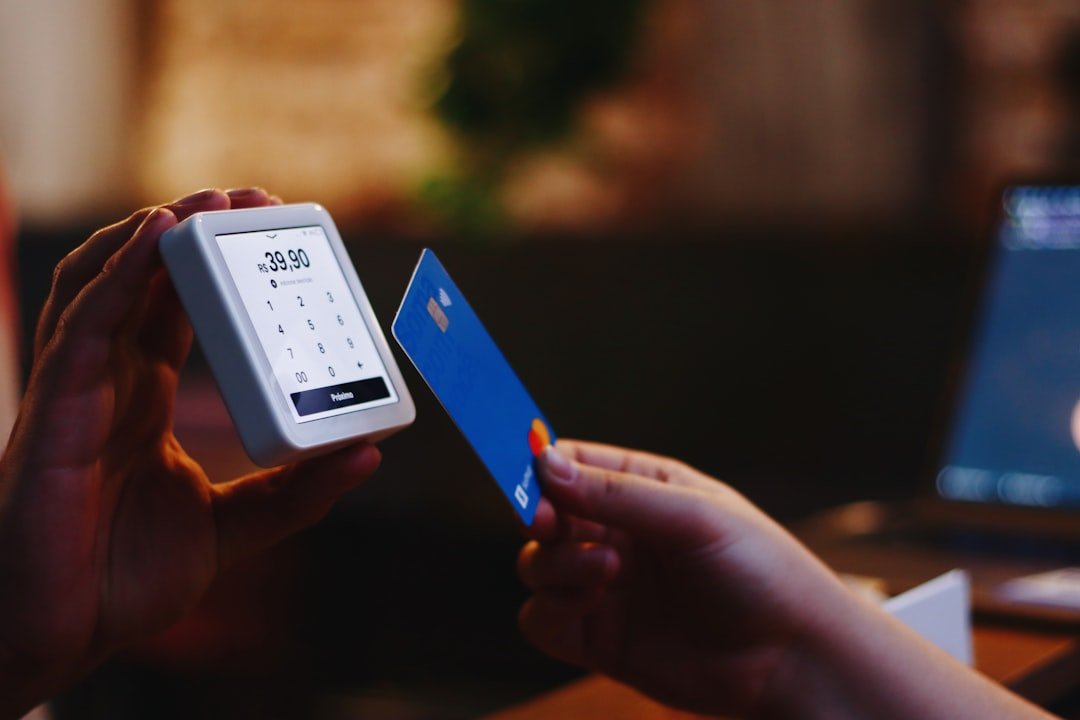
A declined-card message should protect dignity, explain possible next steps, and avoid making the buyer feel accused.

Security reassurance works best when it explains the specific protection buyers need at the exact payment moment.

Financing options should make the payment schedule clearer, not make the price feel smaller by hiding future obligations.

The fastest payment button is not always the best fit for purchase protection, budgeting, returns, or a dispute.

A convincing product page can still hand payment to an unfamiliar seller, imitation site, or unexpected processor.
Nearby shopping routes
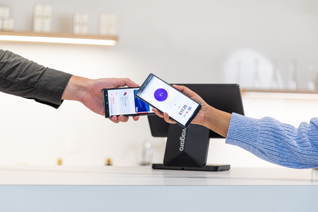
Compare the amount that actually leaves the account, including delivery, memberships, promo conditions, returns, and add-ons.
Decide when an account earns its place, what information it keeps, and which marketing or saved-payment settings can be switched off.

Complete delivery and payment details carefully, recover from broken checkout flows, and avoid duplicate orders or mixed saved addresses.

Compare the complete handoff, understand return costs, and keep the evidence needed for late, damaged, missing, or incorrect orders.
Make the first charge, renewal rhythm, cancellation route, and proof of exit visible before a recurring service becomes background noise.